Putting penguins first, this insurance brand is ultra chill.
Let’s be honest, insurance is usually about as fun as a cold shower. So when we built ICE, we decided to make a strategic hire, a penguin.
CLIENT
ICE Insurance
PROJECT
Branding | Web Experience | UI Design
We anchored the identity in the brand idea that was just one word, ‘chill’. Most insurance interfaces look like a chore. We stripped away the noise to build something that feels functional and minimal the moment you open it. Our penguin became the guiding light; simple and minimal doesn’t have to be boring, and ice cold can actually be entertaining.
The transformation went deeper into the technical core. We rebuilt the mobile platform for the sales team. Instead of forcing them to navigate fragmented processes across health, motor, and personal accident insurance, we standardised the logic into one streamlined flow. This turned the data entry grind into a guided, conversion focused journey. We prioritised reducing the actual workload. It was all about making the software get out of the way so the team can focus on the customer.
Ultimately, ICE proves that when you lead with the penguin pulse, the weirdness of insurance finally starts to make sense.
Insurance is a weird thing. It’s as impossible as this odd shaped flightless bird from the coldest place on earth.
—
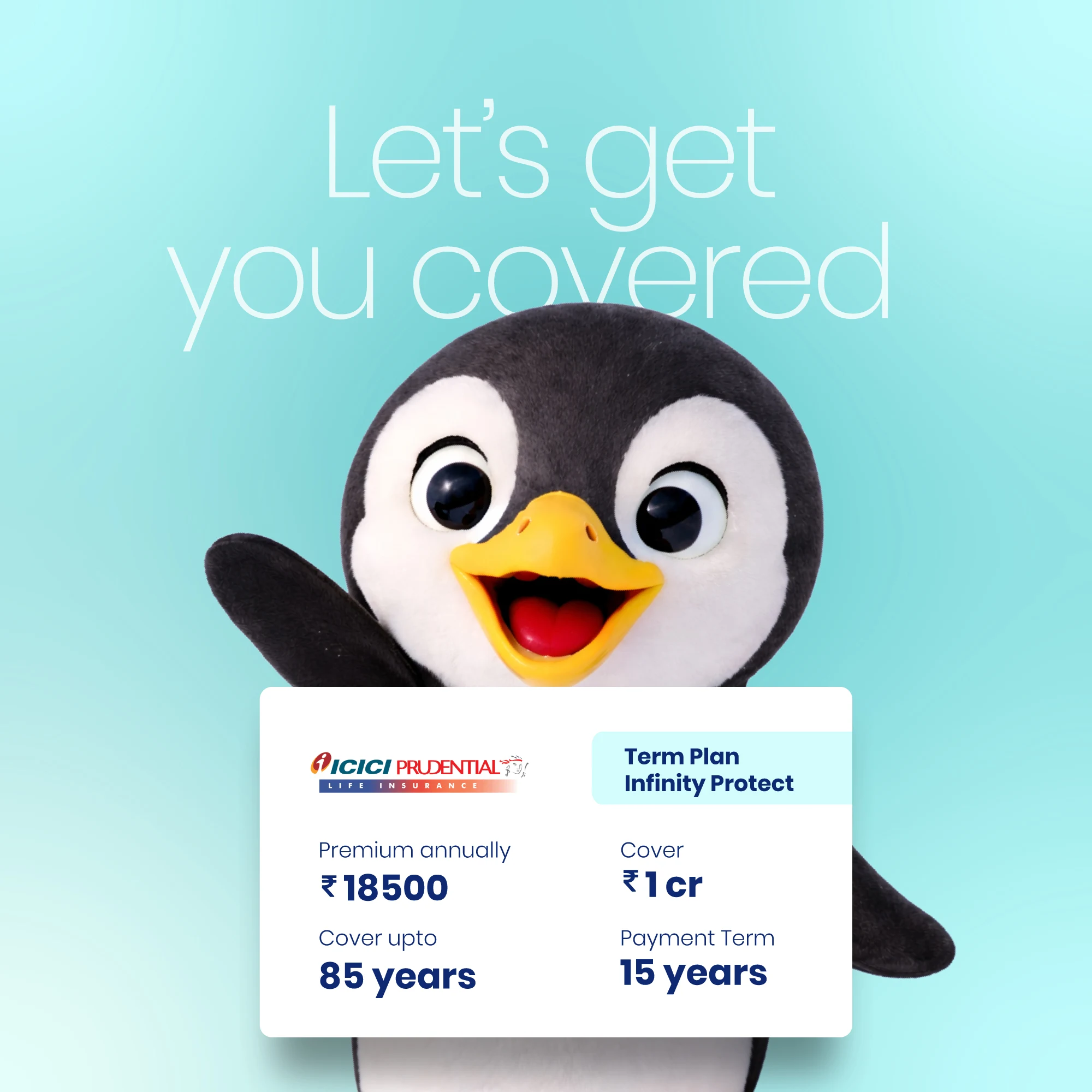
A clean, minimal interface ensures every element serves a clear purpose, creating an intuitive and uncluttered path through the app.
Functional cards, clear drop downs, and subtle micro interactions guide users through the experience with quiet ease.